Almost any front-end environment provides you with at least two ways of building your interfaces: with Interface Builders or by code(some of them even provide a declarative-reactive way). In iOS development, View Code became a very common tool to create UI due to its simplicity and the massive ways of dealing with its XML files(aka storyboards and xibs) and that's why too many people and companies prefer relying on building all its interface by Swift code(or SwiftUI nowadays). But different from iOS, Android provides a very intuitive interface to create UI just with XML files and structure its logic with Kotlin code and inflation processes, which is not so intuitive when relying one hundred percent of the time on Java/Kotlin code.
When I was starting with Android development, I asked one of my colleagues in my company why the organization nor anyone was adopting View Code at all in Android while we were heavily using it on iOS. He said that it was possible, but it was very massive to create a screen with code from scratch and it was so simple to do it with XML, after learning about it, I agree interface builders are a much better approach in Android development. It doesn't have the cons of iOS, where it's not a big deal when we face conflicts in a more than 10-person project.
However, in any technology, there is a great point in learning how to build interfaces by code: you start to truly understand how the UI is built under the hood and you even gain more experience to continue building interfaces with XML. In this article, I will talk about how to create a simple scene with Kotlin code from scratch and compare how to handle each aspect of what we used to do in XML. Hope you enjoy ;).
View Code pipeline
In my iOS articles regarding View Code I always talk about the three steps in the View Code pipeline that should be followed in the same order. We need to build a hierarchy to define how will the relationships between the elements be defined. After that we shall apply some constraints and then some additional configurations:

BuildViewHierarchy: In this step, we should create the hierarchy. It's very similar to what we do in iOS UIKit, but we use the addView function to attach each child to the hierarchy.
SetUpConstraints: This method consists of creating the relationship between each of the children inside a ViewGroup. Just like iOS, four edges should be attached to other ones in a sibling from the same hierarchy: top, bottom, start and end. But different from iOS, the spaces between each one are not part of the constraints. We shall see it later.
ConfigureViews: Any additional configuration like setting layout properties to each element(which can also be done inside lazy declaration, just like iOS).
The core difference from iOS is that despite steps 1 and 2 being followed in this same order, in iOS your application will crash because the constrained elements don't belong to the same hierarchy and in Android, the constraints won't simply work.
Create an interface to the pipeline
To reflect this pipeline, we will create an interface that automates the process:
interface ViewCodeInterface {
    fun buildViewHierarchy()

    fun setUpConstraints()

    fun configureViews() { }

    fun buildView() {
        buildViewHierarchy()
        setUpConstraints()
        configureViews()
    }
}
As you can see, we added a fourth method that calls the three first steps in the required order. We just need to call buildView once your View is loaded(onCreate method).
Setting up View Coded scene
Let's create a new project called ViewCodeDemo, and inside our MainActivity, make it implement the ViewCodeInterface and implement all the methods, calling buildView inside onCreate.
class MainActivity : AppCompatActivity(), ViewCodeInterface {

    override fun onCreate(savedInstanceState: Bundle?) {
        super.onCreate(savedInstanceState)
        buildView()
    }

    override fun buildViewHierarchy() {

    }

    override fun setUpConstraints() {

    }

    override fun configureViews() {

    }
}
You can delete the activity_main.xml file and replace the setContentView method to "inflate" with a root view created by code. Let's create this root view as a ConstraintLayout:
private val root: ConstraintLayout by lazy {
        val layout = ConstraintLayout(this)
        layout.id = ViewCompat.generateViewId()
        layout.layoutParams = ConstraintLayout.LayoutParams(
            LayoutParams.MATCH_PARENT,
            LayoutParams.MATCH_PARENT
        )
        layout
    }

// Set root as content view
override fun onCreate(savedInstanceState: Bundle?) {
        super.onCreate(savedInstanceState)
        setContentView(root)
        buildView()
    }
Note that what we are doing in the setContentView function is the same as we do in the loadView lifecycle function of a ViewController.
You may be wondering what exactly we are doing with those layout parameters. We will check each of the layout properties we are configuring later on.
Constraints
The process of constraining views in Android is very close to what we did in iOS. The core difference is that the constraints don’t contain associated constants. Instead, as we said earlier, those values are related to the view layout parameters themselves. Please take a look on how this process works with a simple example. We still haven't declared the submit button but let's look at how its constraints should be defined:
- Create a
ConstraintSetobject that will be responsible for holding the constraint relations:
val constraintSet = ConstraintSet()
2. Clone the root view. That will be a reference to all the relationships between common siblings:
constraintSet.clone(root)
3. Connect all desired constraints between siblings (or to parent). They will be referenced by their ID’s.
constraintSet.connect(
            submitButton.id,
            ConstraintSet.BOTTOM,
            ConstraintSet.PARENT_ID,
            ConstraintSet.BOTTOM
        )
        constraintSet.connect(
            submitButton.id,
            ConstraintSet.START,
            ConstraintSet.PARENT_ID,
            ConstraintSet.START
        )
        constraintSet.connect(
            submitButton.id,
            ConstraintSet.END,
            ConstraintSet.PARENT_ID,
            ConstraintSet.END
        )
In this case, we are attaching each edge of our button to the corresponding edges of its parent. When we call ConstraintSet.PARENT_ID , we are referencing the root view's ID.
4. At the end, we apply the constraints to our root view:
constraintSet.applyTo(root)
This is how our setUpConstraints function should look at the end:
override fun setUpConstraints() {
        // STEP 1
        val constraintSet = ConstraintSet()
        // STEP 2
        constraintSet.clone(root)
        // STEP 3
        constraintSet.connect(
            submitButton.id,
            ConstraintSet.BOTTOM,
            ConstraintSet.PARENT_ID,
            ConstraintSet.BOTTOM
        )
        constraintSet.connect(
            submitButton.id,
            ConstraintSet.START,
            ConstraintSet.PARENT_ID,
            ConstraintSet.START
        )
        constraintSet.connect(
            submitButton.id,
            ConstraintSet.END,
            ConstraintSet.PARENT_ID,
            ConstraintSet.END
        )
        // STEP 4
        constraintSet.applyTo(root)
    }
Now let's talk about the layout parameters, that contain the "constants" that would formerly be attached to each constraint if we were dealing with iOS.
Layout Parameters
Two required parameters of any element in XML are the layout_height and layout_width. They are basically what defines what the size of your view should be like. When dealing with code, they are configured in the layoutParams method, just like we saw. Let's now attach a single button to our ConstraintLayout and see how it's declared:
private val submitButton: Button by lazy {
        val button = Button(this)
        button.text = "SUBMIT"
        button.id = ViewCompat.generateViewId()
        val params = ConstraintLayout.LayoutParams(
            LayoutParams.MATCH_PARENT,
            LayoutParams.WRAP_CONTENT
        )
        button.layoutParams = params
        button
    }

override fun buildViewHierarchy() {
        root.addView(submitButton)
 }

override fun setUpConstraints() {
        val constraintSet = ConstraintSet()
        constraintSet.clone(root)
        constraintSet.connect(
            submitButton.id,
            ConstraintSet.BOTTOM,
            ConstraintSet.PARENT_ID,
            ConstraintSet.BOTTOM
        )
        constraintSet.connect(
            submitButton.id,
            ConstraintSet.START,
            ConstraintSet.PARENT_ID,
            ConstraintSet.START
        )
        constraintSet.connect(
            submitButton.id,
            ConstraintSet.END,
            ConstraintSet.PARENT_ID,
            ConstraintSet.END
        )
        constraintSet.applyTo(root)
    }
Notice we configured the width of the button to occupy as much space as possible in its parent and its height to occupy just the required space of its content. We added it to the hierarchy and configured the constraints to each side of the parent.
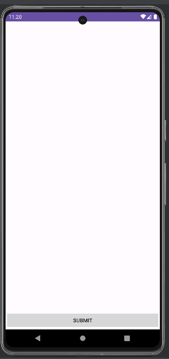
It's very important to notice the layout parameters we instantiated inside the button declaration should come from ConstraintLayout namespace since the button exists in a constraint layout. In case it would be attached to a linear layout, they would come from LinearLayout namespace.
You might also be wondering why we are generating an ID to the button from the ViewCompat utilities class. Any element that we are constraining should have a single identifier. Otherwise, the application will crash.
Add margins to the button
Different from iOS, in Android, the margins are not related to any constraint or stack, but to the element itself. When you set a top margin to the view, it's just some space you are translating it. Create a dimens.xml file under the values folder and add the following content:
<?xml version="1.0" encoding="utf-8"?>
<resources>
    <dimen name="button_radius">10dp</dimen>
    <dimen name="button_horizontal_margin">20dp</dimen>
    <dimen name="button_bottom_margin">32dp</dimen>
</resources>
We now can access each of those properties and attach them to the layoutParams object of our view:
private val submitButton: Button by lazy {
        val button = Button(this)
        button.text = "SUBMIT"
        button.id = ViewCompat.generateViewId()
        val params = ConstraintLayout.LayoutParams(
            LayoutParams.MATCH_PARENT,
            LayoutParams.WRAP_CONTENT
        )
        params.marginStart = resources.getDimensionPixelOffset(R.dimen.button_horizontal_margin)
        params.marginEnd = resources.getDimensionPixelOffset(R.dimen.button_horizontal_margin)
        params.bottomMargin = resources.getDimensionPixelOffset(R.dimen.button_bottom_margin)
        button.layoutParams = params
        button
    }
We are getting the size in density pixels from dimens file through the scene resources object.
Gradient Drawables
Now that we have a button inside our scene, let's define its background. Usually, we create our drawable backgrounds with drawable XML files, but it works with code via Gradient Drawable classes. Let's add a blue background to our button:
 private val submitButton: Button by lazy {
        val button = Button(this)
        button.text = "SUBMIT"
        button.id = ViewCompat.generateViewId()

        val gradientDrawable = GradientDrawable()
        gradientDrawable.cornerRadius = dpToPxFloat(20)
        gradientDrawable.setColor(Color.parseColor("#0000FF"))

        button.background = gradientDrawable
        button.setTextColor(Color.parseColor("#FFFFFF"))
        val params = ConstraintLayout.LayoutParams(
            LayoutParams.MATCH_PARENT,
            LayoutParams.WRAP_CONTENT
        )
        params.marginStart = resources.getDimensionPixelOffset(R.dimen.button_horizontal_margin)
        params.marginEnd = resources.getDimensionPixelOffset(R.dimen.button_horizontal_margin)
        params.bottomMargin = resources.getDimensionPixelOffset(R.dimen.button_bottom_margin)
        button.layoutParams = params
        button
    }

private fun dpToPxFloat(dp: Int): Float {
        val scale = resources.displayMetrics.density
        return dp * scale
    }
We created a drawable with GradientDrawable class and assigned any of the layout properties to it, like corner radius and solid colors. Then, we assign the new drawable as the background of the button. The dpToPxFloat is a utility method we created to convert the number of density pixels to the absolute radius value we are assigning to the layout.
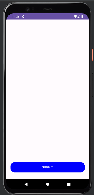
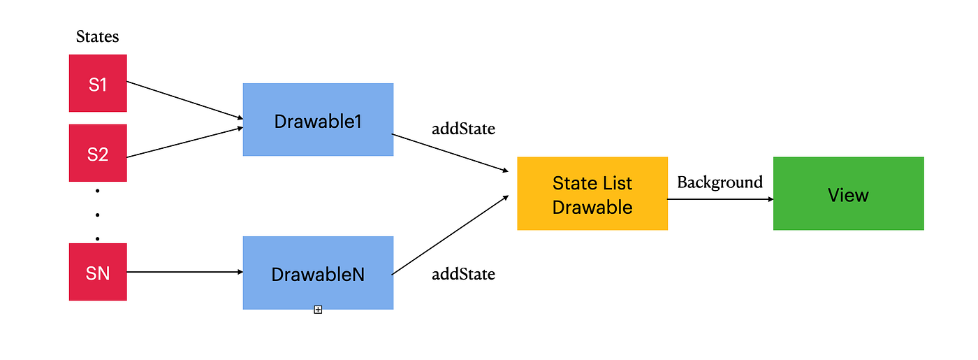
But we still have a problem. We just have this color for the submit button, and we expect to have some visual feedback for the different states of our button, like when it's pressed or focused. For that, we rely on another class called StateListDrawable. This sort of drawer is responsible for holding multiple drawables to be assigned each to a different state of view. Observe how we do it by code:
val stateListDrawable = StateListDrawable()

val gradientDrawable = GradientDrawable()
gradientDrawable.cornerRadius = dpToPxFloat(20)
// Set blue color
gradientDrawable.setColor(Color.parseColor("#0000FF"))

val pressedDrawable = GradientDrawable()
pressedDrawable.cornerRadius = dpToPxFloat(20)
// Set cyan color
pressedDrawable.setColor(Color.parseColor("#00FFFF"))

stateListDrawable.addState(intArrayOf(android.R.attr.state_pressed), pressedDrawable)
// Set default state
stateListDrawable.addState(intArrayOf(), gradientDrawable)

button.background = gradientDrawable
Place the code above inside your button initialization block.
We have two different drawables for active and pressed states. We add them to our state list drawable with the addState method, relating each one to the proper states of our button, defined inside the Android attr file:
And this is how our button looks like now:

Adding Custom Styles to Views
Now let's add two textfields in our scene, each one embedded by a text input layout and then add them to a linear layout:
    private val inputStack: LinearLayout by lazy {
        val layout = LinearLayout(this)
        layout.id = ViewCompat.generateViewId()
        layout.orientation = LinearLayout.VERTICAL
        layout.gravity = Gravity.TOP
        val layoutParams = ConstraintLayout.LayoutParams(
            LayoutParams.MATCH_PARENT,
            LayoutParams.WRAP_CONTENT
        )
        layoutParams.topMargin = resources.getDimensionPixelOffset(R.dimen.stack_top_margin)
        layoutParams.marginStart = resources.getDimensionPixelOffset(R.dimen.stack_horizontal_margin)
        layoutParams.marginEnd = resources.getDimensionPixelOffset(R.dimen.stack_horizontal_margin)
        layout.layoutParams = layoutParams
        layout
    }

    private val loginTextInputLayout: TextInputLayout by lazy {
        val textInputLayout = TextInputLayout(this)
        textInputLayout.id = ViewCompat.generateViewId()
        val params = ConstraintLayout.LayoutParams(LayoutParams.MATCH_PARENT,
            LayoutParams.WRAP_CONTENT)
        textInputLayout.layoutParams = params
        textInputLayout
    }

    private val loginTextField: AppCompatEditText by lazy {
        val textfield = AppCompatEditText(loginTextInputLayout.context)
        textfield.id = ViewCompat.generateViewId()
        textfield.layoutParams = LinearLayout.LayoutParams(
            LayoutParams.MATCH_PARENT,
            LayoutParams.WRAP_CONTENT
        )
        textfield.hint = "Login"
        textfield
    }

    private val passwordTextInputLayout: TextInputLayout by lazy {
        val textInput = TextInputLayout(this)
        textInput.id = ViewCompat.generateViewId()
        val params = ConstraintLayout.LayoutParams(LayoutParams.MATCH_PARENT,
            LayoutParams.WRAP_CONTENT)
        textInput.layoutParams = params
        textInput
    }

    private val passwordTextField: AppCompatEditText by lazy {
        val textfield = AppCompatEditText(passwordTextInputLayout.context)
        textfield.id = ViewCompat.generateViewId()
        val layoutParams = LinearLayout.LayoutParams(
            LayoutParams.MATCH_PARENT,
            LayoutParams.WRAP_CONTENT
        )
        layoutParams.topMargin = resources.getDimensionPixelOffset(R.dimen.password_et_top_margin)
        textfield.layoutParams = layoutParams
        textfield.hint = "Password"
        textfield
    }
Don't forget to declare the dimensions in our dimens file. They will be fetched through the scene's resources object.
<?xml version="1.0" encoding="utf-8"?>
<resources>
    <dimen name="stack_top_margin">64dp</dimen>
    <dimen name="stack_horizontal_margin">20dp</dimen>
    <dimen name="password_et_top_margin">16dp</dimen>
    <dimen name="button_radius">10dp</dimen>
    <dimen name="button_horizontal_margin">20dp</dimen>
    <dimen name="button_bottom_margin">32dp</dimen>
</resources>
As our linear layout is inserted in a constraint layout as its parent, the layout parameters should come from ConstraintLayout as usual. Their children, however, should define parameters from LinearLayout.
Now let's add our textfields to our hierarchy and set up constraints:
    override fun buildViewHierarchy() {
        root.addView(inputStack)
        inputStack.addView(loginTextInputLayout)
        inputStack.addView(passwordTextInputLayout)
        loginTextInputLayout.addView(loginTextField)
        passwordTextInputLayout.addView(passwordTextField)
        root.addView(submitButton)
    }

    override fun setUpConstraints() {
        val constraintSet = ConstraintSet()
        constraintSet.clone(root)
        constraintSet.connect(
            inputStack.id,
            ConstraintSet.TOP,
            ConstraintSet.PARENT_ID,
            ConstraintSet.TOP
        )
        constraintSet.connect(
            inputStack.id,
            ConstraintSet.START,
            ConstraintSet.PARENT_ID,
            ConstraintSet.START
        )
        constraintSet.connect(
            inputStack.id,
            ConstraintSet.END,
            ConstraintSet.PARENT_ID,
            ConstraintSet.END
        )
        constraintSet.connect(
            submitButton.id,
            ConstraintSet.BOTTOM,
            ConstraintSet.PARENT_ID,
            ConstraintSet.BOTTOM
        )
        constraintSet.connect(
            submitButton.id,
            ConstraintSet.START,
            ConstraintSet.PARENT_ID,
            ConstraintSet.START
        )
        constraintSet.connect(
            submitButton.id,
            ConstraintSet.END,
            ConstraintSet.PARENT_ID,
            ConstraintSet.END
        )
        constraintSet.applyTo(root)
    }
Just a recall that you should not add constraints to the textfields that are embedded in the linear layout.
This is what our scene looks like now:
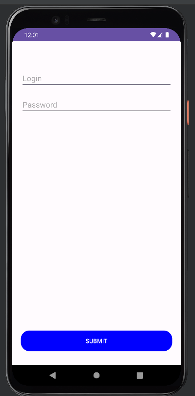
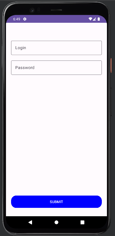
Now let's say we want to add an OutlineBox style to our textfields, follow these steps:
- Place your style in your themes file:
<style name="Base.Theme._7MinuteWorkout" parent="Theme.Material3.DayNight.NoActionBar">
        <!-- Customize your light theme here. -->
        <!-- <item name="colorPrimary">@color/my_light_primary</item> -->
        <item name="customTextInputStyle">@style/Widget.MaterialComponents.TextInputLayout.OutlinedBox</item>
    </style>
It kinda saves your OutlineBox style in a customTextInputStyle namespace.
2. Declare your new style as an attribute in attrs file:
<?xml version="1.0" encoding="utf-8"?>
<resources>
    <attr name="customTextInputStyle" format="reference" />
</resources>
3. Instantiate your text input layouts by injecting your new style:
    private val loginTextInputLayout: TextInputLayout by lazy {
        val textInputLayout = TextInputLayout(this,
                                              null
                                              R.attr.customTextInputStyle))
        textInputLayout.id = ViewCompat.generateViewId()
        val params = ConstraintLayout.LayoutParams(LayoutParams.MATCH_PARENT,
            LayoutParams.WRAP_CONTENT)
        textInputLayout.layoutParams = params
        textInputLayout
    }

    private val passwordTextInputLayout: TextInputLayout by lazy {
        val textInput = TextInputLayout(this,
                                        null,
                                        R.attr.customTextInputStyle)
        textInput.id = ViewCompat.generateViewId()
        val params = ConstraintLayout.LayoutParams(LayoutParams.MATCH_PARENT,
            LayoutParams.WRAP_CONTENT)
        params.topMargin = resources.getDimensionPixelOffset(R.dimen.stack_spacing)
        textInput.layoutParams = params
        textInput
    }
Don't forget that the context of both fields should correspond to the same as their parents to fetch their styles
val textfield = AppCompatEditText(loginTextInputLayout.context)
Now you shall see something like this:
Conclusion
Even if we have the ease of an XML/Interface Builder tool to create our UI without code by hand, learning how to create all of a complex interface from scratch with code is essential to master a front-end technology, no matter if it's iOS, Android or hybrid. Any View Code pattern follows a very similar pipeline starting with the hierarchy, following constraints or any layout configuration and then additional configuration and styling. In Android it's not too different from iOS, but the same way of thinking. I hope this article provided you with a great overview of how Android UI works under the hood and that you improved your knowledge about how mobile interfaces are created.